In this article, we will look at the evolution of the logos of some of the biggest companies in the world - Coca Cola, Mercedes-Benz, Apple, FedEx, Adidas, etc.
The purpose of a good logo is to introduce potential customers to the company and business you are in. The logo forms the first impression and the customers' attitude towards the brand. It should be as clean as possible and focused on the company's activities. Creating a logo sometimes takes months so that the brand identity can be highlighted in detail.
In the first part of the article series "The history of the most famous logos in the world" we will introduce you to five of them.
First of all in this article we will look at the Coca Cola logo.
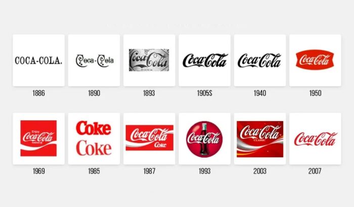
The logo was created in 1886 by Frank Mason Robinson, who worked as an accountant for the company and had nothing to do with graphic design. A typeface named "Spencerian" was used for the logo, which was then used in official documents. Even more interesting is the history of the colour red. In 1900, Coca Cola was sold from barrels, as was alcohol. With the difference that soft drinks were not taxed. So the producers of the drink decided to paint their barrels red, for the convenience of customs and tax officials. Coca Cola's colour is patented and is a mix of three shades of red.
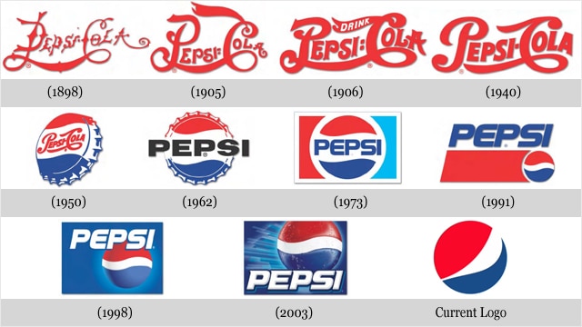
Secondly, we will look at the Pepsi logo - created in 1898.
In 1962, it underwent its first drastic change, removing the word "Coke" from its name. In fact, the company logo symbolizes the earth's magnetic field, probability theory and Feng Shui, according to a branding agency report.
By 2005, it was becoming more and more stylish and minimalistic, as it is today.
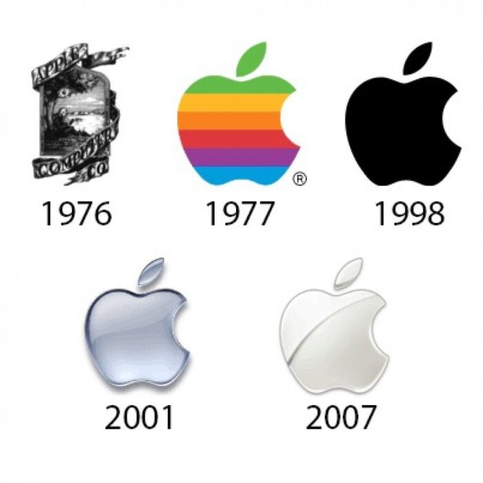
The Apple logo is in third place in our article.
It was created quite ornately in 1976 , designed by company co-founder Ronald Wayne and inspired by Newton's discovery of the force of gravity. In the words of Steve Jobs, it is understood that he did not want such a beautiful and ornate logo. So Rob Janov developed a new one. It is colourful and symbolises the ability of computers to visualise colour. Later, with the release of the Apple Macintosh on the market, due to the great popularity of the brand, the logo remains on its own, without the word 'apple'. Since 1984, the company's symbol has not changed. Only a play with colours and shadows is observed.
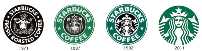
Starbucks - the fourth logo we will look at.
The idea for the logo came in 1971 when the founders of the coffee came across a 14th century carving of a siren (mermaid) with two tails. Terry Heckler made the company's first logo with a naked siren and a crown on the head. After the first redesign of the logo, the siren is now smiling and the crown and tails are less pronounced. The last changes, which are still the case today, removed the circle around the emblem and replaced the black with green. And for 40 years the siren has been interlinked with the coffee brand.
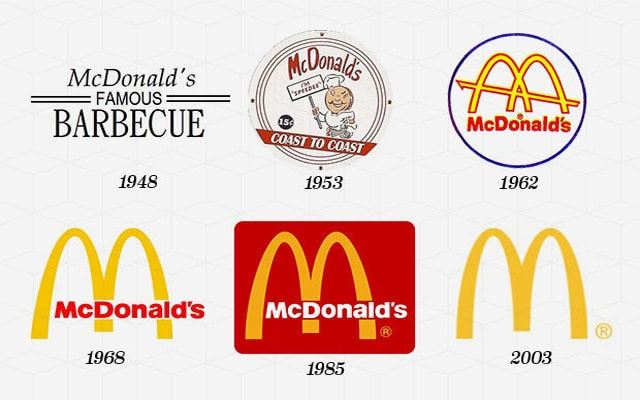
The fifth logo in our article is by Mac Donald's
It was founded in 1904 by Jim Schindler. McDonald's famous BARBECUE, with the word famous underlined twice. Autumn years later, the logo changed to McDonald's famous HAMBURGER. In 1960, Stanley Meston, transformed the logo into golden arches that form the letter "M". Six years later, a black "MacDonald's" is added to the "M". In 2003, the words "I'm lovin' it" appeared below the "M". And since 2006, the decision has been to simplify the logo as much as possible, leaving only the golden " M"
As a conclusion, one can draw the fact that big brands prefer and rely on minimalism. It is becoming less and less common to see logos with lots of words, pictures or colours.
If you liked the above and want to learn about the creation of our logo click here . Stay tuned for our next article "Evolution of 5 of the most famous logos in the world", which will be a continuation of this one.
NewwwDesign will create your logo
You own a business, but you find it difficult to implement your activity in a symbol, read about the service we offer and look for a quote! For a brand to be successful and recognizable, it must have its own distinctive sign. We will create it according to your company policy and consumer orientation.
Sources: profit.bg, mmtvmusic.com, en.applemacion.com, de-sign.bg, globusks.ru, peskiadmin.ru